I can't decide which picture to use as the main listing image when listing my yarns on Etsy and Coriandr. It's hard to decide which is more likely to draw a potential customer in to have a closer look. I tend to photograph all my yarns in 5 set ways but choosing one as the main image is difficult! Any comments are appreciated too :) Thanks for voting!
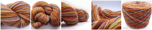
1. End of Skein 2. Whole Skein 3. Perspective Skein 4. Loose Skein 5. Yarn Cake
Created with fd's Flickr Toys


7 comments:
I think all of the photos are beautiful, why not alternate the main image with each listing? :)
Definitely the loose skein for me – beautiful colours by the way :)
@Ruby Spirit Designs - Thank you very much! And alternating the images is what I have been doing so far. I think I am too 'tidy' as I'd like them to look the same! lol
@Dig The Earth - Thank you for voting! And i've just realised that this skein looks very similar to your Zen Earth cards :D
LOL I was going to put that in my post...but this is about your work not mine! :P
I voted for 1st but I love the 4th as well. It's good to see as much as possible of the thingie I think.
But then all the photos are great (except for the last one because colors get lost in it)
Take care.
I voted! I picked #2! :)
#2 for me. i agree with nini that it's good to see it as a whole. the colors and how it 'feels'. (even if nini voted for #1 :) )
but from my (non-crafting) artistic side i like #3 and #4 the most.
oh and #5 definitly isn't good because as said it completly disrupts the colors and look you'll get with this skein.
Post a Comment